In general it is easy to stereotype people with specific features or that belong to a certain group. This also falls into design.
When presented with a chosen subject to work on it is too easy to take the research you find to create something so precise that it reaches a point in which it becomes almost a stereotype in itself.
The way to avoid this is to really take the research gathered and flip it around, change the finer details while still remaining true to the information collected.
This Guardian advert from 1986 proves how a shift in point of view, from a generally negative outlook on an individual, can drastically change the outcome of a situation. The same principle can be applied to design.
This advert won a gold Lion at Cannes.
The Guardian’s use of a stereotyped character in the advert was to visually express to the viewer and their audience that their publications were not biased or incorrect, that they always looked at the full picture – not just one side of a story. By making the skinhead (who in 1986 would vastly be stereotyped as a nuisance in society) the hero in the visual story it shifts the audiences perception of the individual and his actions. It really makes them think about their own thoughts, and most importantly it makes an impact.
In my work I am planning to look at punk women, but I do not want to focus on the masculine or aggressive connotations associated with them, instead I want take them out of that context and put them as individuals into a surreal situation. For example, one may find a woman who is a punk and take footage of them in a club, I want to change that and put them somewhere unexpected.
In 2016 Neville Brody designed the typeface for an exhibition all about punks, and instead of being the stereotypical ransom note type that is associated with the punk movement he created something more uniform.
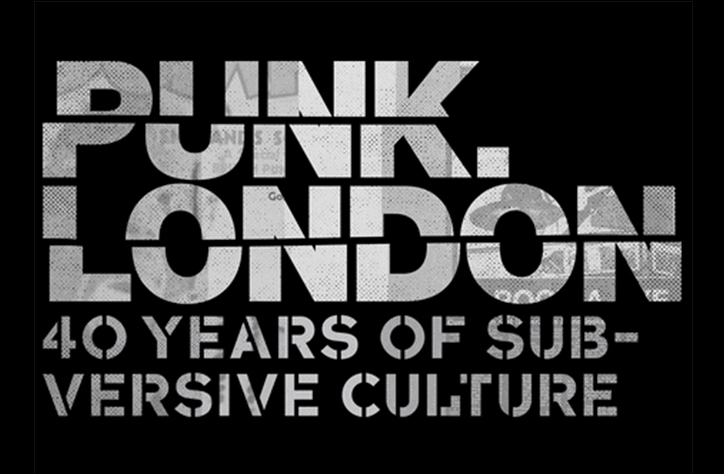
Brody’s approach to the Punk London exhibition in 2016 defied the expectation that the design would be reminiscent of the DIY visual identity associated with the original punk movement, instead it was clean and precise but with its own twist.
This approach almost shocks the audience as it’s unexpected, almost the opposite of what the original punk visual identity looks like. This brought it an amount of attention and became part of the exhibition itself.
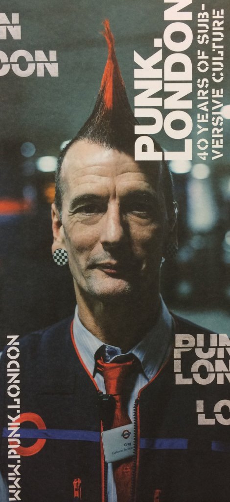
(https://www.hemingwaydesign.co.uk/projects/transport-london/)
The use of such a simple visual identity atop of the image of the London Tube worker, Greg Cosens, is vital in the fact that it isn’t using the stereotypical punk aesthetic to speak to the audience, it is instead using the image of Greg to communicate.
